
It wasn’t always the case that user experience was at the core of building software. In the early days of technology, and even when first visual operating systems were already created, it wasn’t obvious that software should not only do its job, but be also easy and pleasant to use. Nowadays, user experience is taken into consideration from the very beginning of making a new software. It is impossible to start building something new without analyzing user personas, their goals and struggles, and making sure the user flow complies to best UX practices. But it’s already not enough, as product owners should also make software inclusive and think about accessibility in development.
Business
How to Create Accessible Software Products
How to develop software following the people-first approach? Learn about software accessibility design, development and testing.
AN
Alla Nabatova
Lead Business Analyst
September 19, 202310 min read
Share

Contents
Intro
What is Software Accessibility
Accessibility is a set of practices in building software products to address discriminatory aspects related to equivalent user experience for people with disabilities. Accessibility means product owners should care about people with disabilities not only because of the practical considerations such as extending the user base, but also because access for information is defined as a basic human right (source: UN)
More and more businesses and institutions already pay attention to make their software accessible. For example, one of the Waverley customers, Yale Center of Emotional Intelligence, expects that all the software products, including the ones developed by the vendors, meet Yale University’s accessibility requirements.
Software Accessibility Requirements
To make the software accessible, product owners should evaluate four accessibility principles elaborated at the Web Content Accessibility Guidelines. It is important to keep in mind those principles right from the beginning of designing the product as they affect the whole user experience. You may end up rebuilding the entire user flow if some of the accessibility principles are violated.
The accessibility principles say that to be accessible, software must be perceivable, operable, understandable and robust.
- Perceivable: User interface cannot be unretrievable. There should be no hidden data, all non-text data should have text alternatives, there should be as little non-text options(such as icons, pictograms for the menu items) as possible. If an application contains pre-recorded audio or video, it must provide the way to access the script of those recordings.
- Operable: UI components and navigation must be operable. For product owners, it means that applications should not contain navigation options which are time limited, device-limited, or layout-limited. Make sure the navigation is still available when the user changes the device orientation to portrait or landscape. Don’t rely on flickers or flashes to obtain user attention as it may cause seizures. Always specify user location within the app and the possible navigation options.
- Understandable: Information and the operation of the user interface must be understandable. Avoid overloading the interface with abbreviations and complex vocabulary. Instructions must be clear and concise.
- Robust: Content must be robust enough that it can be interpreted by a wide variety of user agents, including assistive technologies. The technology used by a software should support as many assistive technologies as possible without decreasing the quality of the user experience. It means your product must have automated accessibility so to be friendly for screen readers, external keyboards, browser plugins, etc.
How to Meet Accessibility Requirements
Software Accessibility Design
There are a few simple steps in user interface design that are easy to implement and using them for everyone can make their product more affordable. With the help of these rules, you can help not only people with disabilities but others as well. Designed in this way, high quality and legible text for people with vision problems can also help people with perfect vision who use the app outdoors in bright sunlight.
So let’s take a closer look at these steps toward web accessibility to understand each one of them.
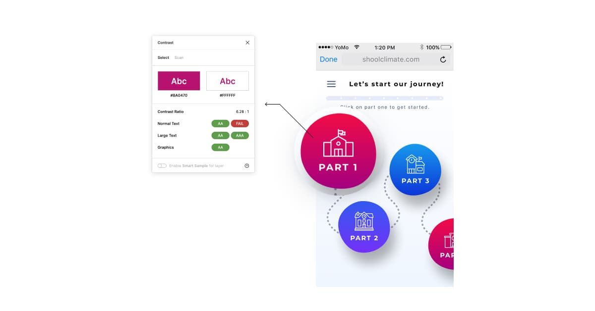
- Color and color contrast.
Color and color contrast play an important role in the design of the interface and it’s very important to think over them in advance and use those colors that are safe for all users to ensure web accessibility. In order to make sure that the color and color contrast are correct, there are several useful tools where you can check compliance for accessibility in development. One of these tools is the Color Contrast Checker, you just need to enter the desired combination and the program will give you the result. Or if you work in Figma, then you just need to install such plugins as Contrast and Stark, they can give you the more detailed information. Also, Stark has a visual simulator with which you can look at your own design through the eyes of a person with common color vision challenges.
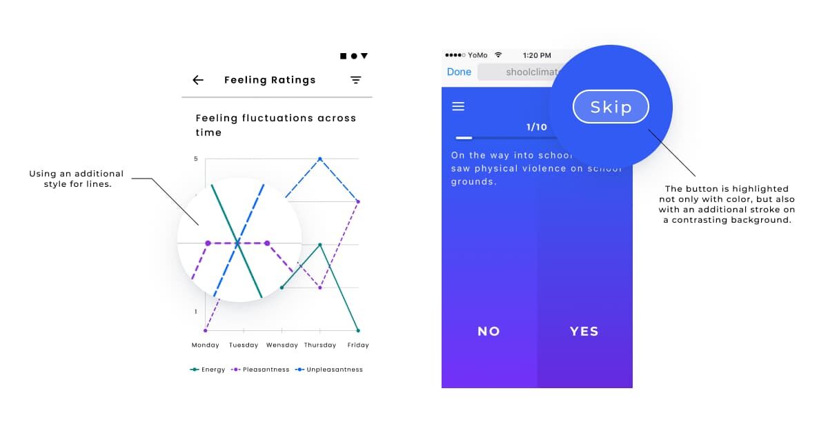
- Use additional indicators for design elements.
Color is not used as the only visual means of conveying information, indicating an action, prompting a response, or highlighting a visual element. These are part of the accessibility tools that make it much easier for a visually impaired person to understand what is required of him if, in addition to contrasting color, indicators such as marks, icons, patterns, etc. are used. For fonts, you can use a different weight or underline style; for icons, different states and sizes to ensure accessibility in development.
- Markup language.
Use an easy-to-understand markup language to avoid losing the main function or properties of the element when you design accessibility in development. The key is to use the correct structural elements when designing, so that the browser can read what content they contain and how the browser should display or process that content. The components and structure of the page is what makes up the accessibility considerations tree. This tree provides screen readers that can be used by people with visual impairments or those with text-based challenges to “listen” to the page.
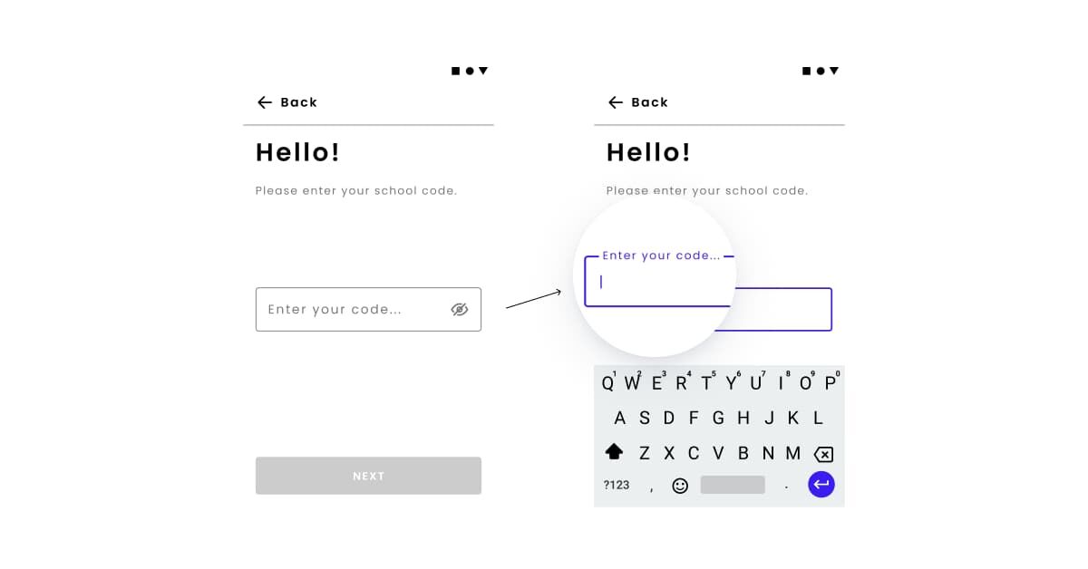
- Use a label in the fields instead of a placeholder.
Always help people figure out what to do and write in the form. It’s best if the shortcuts don’t go away even when the person fills in the input. When you design accessibility in development, it is very important that people always see and know the context of what they are writing. Also, you don’t need to clutter everything up with supporting information, just make sure that the person has enough information to complete their tasks without problems, this will help to achieve automated accessibility.
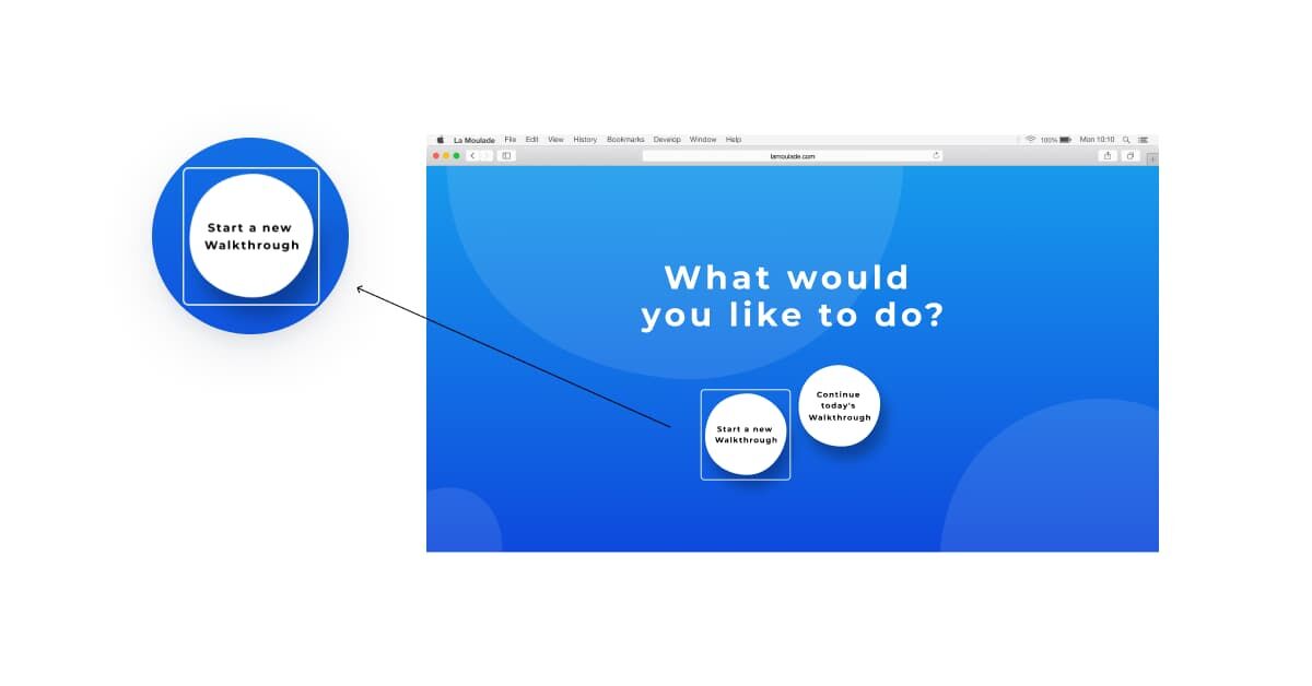
- Focus indicator.
Focus indicators help people know which element has keyboard focus and also helps them understand where they are when navigating your site which makes for automated accessibility on the development end. The elements that must be available for focus are links, form fields, widgets, buttons, and menu items. It is best to take this into account right away, even at the stage of styling development, so that it is easier for the developer to implement the desired behavior for the interface elements, and the designer does not have to redo the work.
- Non-textual content.
All non-textual content that is presented to the user has a textual alternative that serves a similar purpose. Visually impaired people often use screen readers to “hear” the Internet and fix accessibility gaps on websites. Accessibility services convert text to speech so that a person can hear the words on the site.
- Use the keyboard navigation.
Keyboard accessibility is one of the most important aspects of web accessibility. Many power users, who do not have any impairments, quite often use the keyboard to navigate the site. And for people with motor, visual, or text-based impairments, who rely on screen readers, this is the only way to navigate the content.
Software Accessibility Development
Things to consider for implementing accessibility from the development perspective for accessible websites:
- Follow the platform accessibility guidelines. There are accessibility guides for both major mobile platforms (For Android, for iOS). Popular cross-platform frameworks also provide rich accessibility instructions. Here is one for Flutter.
- All tappable areas should be minimum 48×48 pixels
- Use the ALT attribute for all images
- Make sure all the elements have the outline
- Use HTML semantic elements
Accessibility Testing
Tools for testing web accessibility:
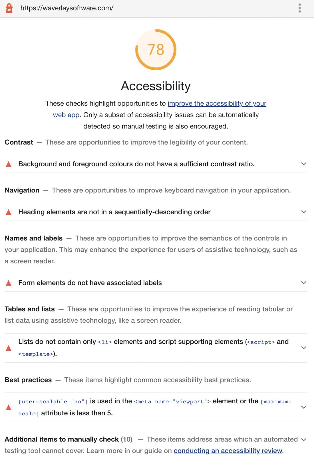
- The Lighthouse Chrome extension. The plugin checks the web content for accessibility issues and gives you an accessibility roadmap. Lighthouse does automated accessibility testing for you and provides the overall score and gives detailed recommendations on how the page can be improved for web accessibility. For example, it can point to the images that don’t have the ALT attribute and therefore will be missed by the screen readers, one of the common accessibility issues. Or, it can specify the places where colors are not contrasted enough which contributes to a more accessible web.
- The Axe browser extension. This extension checks web pages for the wider list of accessibility issues that correspond with WCAG A and AA standards to make it an accessible website. Axe provides a detailed list of the issues and recommendations on how to fix them for accessibility compliance.
- Though tools for automated accessibility testing are extremely useful, they cannot catch all of the issues. The best approach is to treat accessibility testing as a part of the testing process and run an evaluation of your web service or mobile application against the WCAG standard manually. At Waverley, we created the spreadsheet for each of the A and AA criteria for the regression testing. We also recommend using the app with accessibility tools enabled while working on accessibility in development. For example:
- Turn on the screen reader and see whether your application is usable with it.
- Significantly enlarge or decrease the font size
- Use your website with the keyboard only
- Use application in both screen orientations
- Check whether the product is usable if all multimedia data is turned off
The accessibility testing is not limited to checklists. WCAG provides case descriptions for each of their principles which can be used for accessibility testing.
Summary
For successful implementation, mobile and web accessibility should be treated as a solid part of the development process. It is important to develop an empathy culture within the engineering team, emphasizing that people with disabilities are people first and foremost. Cultivating people-first language and thoroughly studying the inclusive design guides, running product evaluation from the perspective of several personas allow achieving accessibility compliance. Inspiration can be found in such sources as Microsoft Inclusive Design Guide, GDS web accessibility personas, or an alphabetical list of accessibility issues.
Resources
https://www.w3.org/WAI/fundamentals/
WCAG Guideline: https://www.w3.org/WAI/WCAG21/quickref/?versions=2.0#principle1
Mobile accessibility considerations: https://www.w3.org/TR/2015/WD-mobile-accessibility-mapping-20150226/
Learn more about Yale Center for Emotional Intelligence: https://www.ycei.org/
Learn more about the school climate walkthrough: https://inspiredstudents.org/yale-school-climate-walkthrough/
Acknowledgments
Special thanks to Jessica Hoffmann, Nicole Elbertson, Christina Cipriano and Rachel Baumsteiger from Yale Center for Emotional Intelligence for your review of this article and useful comments.
Thank you Alina Chepinoha (UI/UX Designer at Waverley) and Viktor Tsymbal (Software Engineer at Waverley) for providing your expertise and consulting me on various matters for this article.
About the author & stay in touch
Stay up to date
Subscribe to Waverley's newsletter and stay up to date with the latest articles.
Keep Reading
Related Articles

Business
From Cold Calls to AI-Assisted Dialing: Lessons from Tendril’s Founder
5 min readNov 20, 2025

Business
Team Health for Efficient Engineering Teams
6 min readFeb 17, 2025

Business
Why Outsource Software Development to Poland
18 min readNov 5, 2024

Business
Why Use Flutter: Pros and Cons of Flutter App Development
18 min readOct 30, 2024